Magazine Cover
Masthead
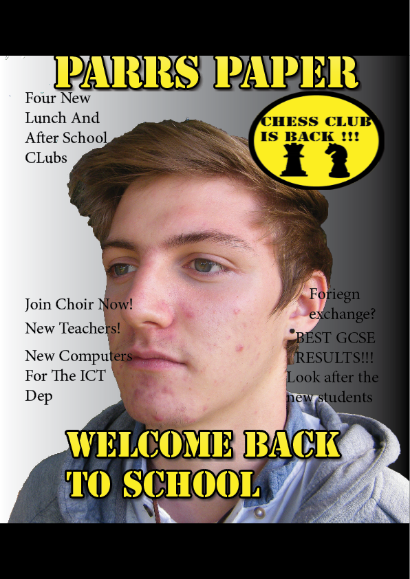
Here is my masthead I called Parrs Paper as Parr was one of King Henry VIII wives. I didn't change it from my draft as I thought that it was good enough and that it rolled off the tongue. I think that it is easy to remember and its main colour yellow and the outline is black which is the school colours so i made it the main colours for the masthead and the splash.
 Splash

My splash was made for the start of the school year that is why it says welcome back to school. It has the same font and size of the masthead as it is the main story of the magazine. it is simple and easy to read. it also has the same colour of the masthead once again as it is the schools two main colours which is black and yellow. The main text is yellow and the outline is black to make it easier to read on a light background.

Pug
My pug is once again the same colours of the masthead and the splash. it says on the pug chess club is back I didn't change it from the draft as I thought that it was good enough and it will make more people want to join the club. It has two pictures of chess pieces and the text is onec again simple and easy to read. I think that it is
Main Image
 My main image is of a boy looking away from the camera. It is different from the draft as I had a boy with black hair but was looking at the camera. I think it is simple and the grabs the reader attention as they want to know who is on the cover which would make them also look at the stories.
Full Cover

Here is the full cover I have in total seven sell lines which allows the reader to see what over stories in the magazine. I moved them around so that they can all be seen that is why there is three on the right and four on the left. there isn't that much dead space. The sell lines are in a grid layout that is why they are opposite each other. I tried to fill in the space with another pug but it covered the main image. I have a footer and header and there is a black and white gradient in the background of the picture. I think that the gradient in the background goes well with the magazine and the main colours. The colour scheme of the magazine is black, whit and yellow this is due to them all being the colours of the school apart from the white. The colours go well with each other.
The layout and design of your cover is conventional and you have used Photoshop successfully to remove the background of the main image. To improve the overall page, you could have included appropriate text in the header and footer bar.
ReplyDelete